
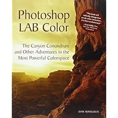
 In an earlier blog I mentioned that one of my Christmas presents was Photoshop Lab Color: The Canyon Conundrum and Other Adventures in the Most Powerful Colorspace which, as it goes, is a very long title for a book.
Well I have finally finished it and I have to say it is really rather good. The easy writing style helps, the tutorials clear and there is a CD of images so that you can try it all out yourself on the images in the book.
The LAB colour space is designed to work in a similar way to the human eye and as such allows us to do things that are almost impossible in other colour spaces. When we view a scene we often perceive it as much more colourful than the film/sensor records it.
Anyway whilst on ephotozine the other day I uploaded a modification to this picture of Filey beach by Neil Davis.

I enhanced the colours with a simple LAB move that I learnt from the book, I promised to explain what I did to Neil, so here's how to do it.
The image has a very slight blue cast so we need to fix this before we enhance the colours otherwise we will end up with a bluer cast.

I Selected Image>Adjustments>Colour Balance and moved the yellow/blues slider towards Yellow a little (about -5) and repeated this with Shadows, midtones & highlights selected down the bottom.
Now its time for the lab magic.
Select Image>Mode Lab Colour. The Image>Adjustments>Curves.
First alt-click on the background of the graph thingy till it shows a series of fine grids like this:

We will ignore the lightness channel - you'll have to get the book to see what that's for, and select A from the channel drop down at the top of the screen.
Now slide the bottom point across to the first grid-line (the input box should read 10). Then slide the top point across to the first grid-line (the input box should read 90). You should get a curve that looks like this:

Now select channel B at the top and do the same with that. Click OK.

For a further colour boost you can use steeper curves so that they run from 20 to 80 instead of the 10 to 90 in the example. or even 30/90 as I have done here:

In the next blog posting I shall show a comparison of the different colour boost methods for you to compare.
No comments:
Post a Comment