Saturday, 31 March 2007

Creating an ECommerce site using iView Media Pro and the PayPal Shopping cart

First visit Dave Beckermans guide to using iView and PayPal as it covers an awful lot of the basics you will need, The main difference between his method and mine is that he has individual sizes and prices for each picture where as my method is designed for a gallery where all the prints are the same sizes & prices.

Take a look at the Galleries on this site, to get an idea of how the web pages generated by this method. While you are there why not buy a picture or two.....you know you want to.

How to do it

  • Download the Paypal.zip file.
  • Unzip the contents into the iView HTML template directory which is under the Plug-ins directory of iView media pro.


Set your products and paypal items

Open the Media.html file (its in the paypal directory you just created) in notepad or an HTML Editor. Find the section that looks like this:
<!-- iView HTML Engine Directives
(iView:InMediaWidth 500)
(iView:InMediaHeight 500)
(iView:Variable name = "Gallery Title" default = "")
(iView:Variable name = "PayPalAccount" default = "paypal@paypal.com")
(iView:Variable name = "ReturnScreen" default = "http://www.yoursite.com/Success.html")
(iView:Variable name = "CancelScreen" default = "http://www.yoursite.com/Galleries.html")
(iView:Variable name = "CurrencySymbol" default = "£")
(iView:Variable name = "CurrencyCode" default = "GBP")
(iView:Variable name = "Item1Description" default = "18 x 12 inch Mounted print")
(iView:Variable name = "Item1CodeNo" default = "")
(iView:Variable name = "Item1Price" default = "75")
(iView:Variable name = "Item2Description" default = "18 x 12 inch Framed & Mounted print")
(iView:Variable name = "Item2CodeNo" default = "")
(iView:Variable name = "Item2Price" default = "125")
(iView:Variable name = "Item3Description" default = "24 x 18 Mounted print")
(iView:Variable name = "Item3CodeNo" default = "")
(iView:Variable name = "Item3Price" default = "250")
(iView:Variable name = "Item4Description" default = "24 x 18 inch Framed & Mounted print")
(iView:Variable name = "Item4CodeNo" default = "")
(iView:Variable name = "Item4Price" default = "300")
-->


You need to change the value in quotes for default for each line that begins with (iView:Variable name

The Settings:

Setting Current Value Description
Gallery Title
Title of your Gallery - best left blank
PayPalAccount paypal@paypal.com Your paypal account ID
ReturnScreen http://www.yoursite.com/Success.html URL to return to after a succesful purchase
CancelScreen http://www.yoursite.com/Galleries URL to return to after the user has pressed cancel
CurrencySymbol &pound; Currency symbol in HTML (£ = &pound;, $ = $ € = &euro;)
CurrencyCode GBP Currency code (GBP = pounds, USD = dollars, etc )
Item1Description 18 x 12 inch Mounted print Description of first item type you sell
Item1CodeNo
A code number for this item if you have one
Item1Price 75 Price for item 1
Item2Description 18 x 12 inch Framed &amp; Mounted print Description of second item type you sell
Item2CodeNo
A code number for this item if you have one
Item2Price 125 Price for item 2
Item3Description 24 x 18 Mounted print Description of third item type you sell
Item3CodeNo
A code number for this item if you have one
Item3Price 250 Price for item 3
Item4Description 24 x 18 inch Framed &amp; Mounted print Description of fourth item type you sell
Item4CodeNo
A code number for this item if you have one
Item4Price 300 Price for item 4


Having made all the changes, save the file.

Creating the Galleries

Now go to iView and select the items that you wish to appear in your gallery.
Select Make>HTML Gallery...
On the Theme tag check the settings.


Click the Theme Fields Tab and change any fields that you need to.


Click Make... and chose a directory to load the gallery into.

That's about it, if you have any questions please add them as comments at the bottom of this article and I will see if I can help.


Related Posts

An Alternative template for Paypal and iView Media Pro

Tuesday, 27 March 2007

Sprucing up the Joint

I've been a bit busy over the last few days changing the Galleries and Exhibitions Sections of the site. The site even includes the obligatory gradient background that all css based sites seem to have these days.

The main reason for this is that I wanted to change the way the galleries were generated. Previously I used Breezebrowser to generate the web galleries through The EOS template. There were two main reasons for deciding to change.

  • Breezebrowser is an excellent product and I use it at the front end of my workflow to sift through the images and quickly sort out the shots I don't want. The trouble is that generating web galleries is usually an end of workflow thing for me, and by the end of the workflow my images are all safely stacked away in iView Media Pro. So using iView would be a much better option.
  • The EOS template is a fantastic piece of javascript programming an for event/wedding photographers it does a great job of delivering galleries for users to buy prints from. The problem from my point of view is that all that javascript stops the site being indexed by search engines. Additionally i wanted something I could easily controll with css and minimal javascript and it was time for a change.
I decided to use the iView HTML generation technology combined with the Paypal Shopping Cart system to produce exactly what I wanted. In a future blog I will provide some instructions on how to do this yourself for those who are interested.

In the meantime here is a picture I found whilst tidying up the galleries:


Triplet

Wednesday, 21 March 2007

Southwold Location Report

As I may have mentioned I am the Photo Locations Editor for Ephotozine. The idea of the Locations Section is for people to share their favourite photographic location with other photographers, whether it is ideal for Landscapes, Architecture, Wildlife or anything else.

I have just posted up a report for Southwold, as I was recently up in Suffolk enjoying this beautiful part of the world. For your enjoyment here is a shot taken from the bowls of Southwold Pier:

Under the Pier
(click to view large)

Tuesday, 20 March 2007

Compositon

Keith Henson of Northscape has produced a very interesting article on composition worth of a read by beginners and experienced photographers alike.

Also of interest is Paul Indigos series on Design in photography - Part1 & Part 2. Hopefully Paul will get round to writing the other parts soon.


Spring Gold - Which compositon rules have I use/broken here?
(Click to view large)

Monday, 19 March 2007

Extracting The Abstract

I have been having an interesting discussion about abstract images with Lewis R, its always interesting to discuss with other photographers the "why" of photography as well as the "how".

I really love this latest image of his:


I'm not sure why I like it...I just do! Why not visit the rest of his abstract photography blog, there are some very interesting images there.

Friday, 16 March 2007

Location, Location, Locatrion

Apart from maintaining this fine blog-thingy, I am also the Photo Locations Editor for Ephotozine. The idea of the Locations Section is for people to share their favourite photographic location with other photographers, whether it is ideal for Landscapes, Architecture, Wildlife or anything else.

I have just posted up a report for Durdle Door which is a very beautiful part of the world and a great place to be early in the morning.

Durdle Door
(Click to view large)

Previous location reports I have written are:

Thursday, 15 March 2007

In praise of the snap

It's so easy for the keen photographer to fall into the trap of only taking "important" photographs.

We get up at stupid times, drive for miles and wait patiently for the light to be right for that important shot, we then spend ages converting and managing our images to produce the result we want. But, in 10 years time, will these shots be close to our hearts? I doubt it.

We spend hours setting up home studios, to get stunning images of a model we don't really know or a beautiful still life that looks good on the wall. Will we ever clutch these images to ourselves and smile? I don't think so.

We grab the camera and take a snap of a loved one, who is just being themselves. The lighting is rubbish, the background cluttered and you didn't even hold the camera straight. Is this an important picture? You betcha.

The shots that really mean a lot to us will be the snaps of those we love, or a few grabbed shots of a happy time. Holiday snaps act as a postcard to our future selves, sending us messages of great times and golden memories. A single snap of a lost loved one can mean so much more than a hundred "fine-art" prints.

There is nothing wrong with striving to produce the finest shots you can, but don't forget to take a few snaps while your there...you won't regret it.

To be honest, I had real trouble finding images to illustrate this article. I had plenty of snapshots that are important to me but most of them were so personal that I didn't feel happy about sharing them on the web. So here is a snap that is important to me:


It is a picture of the day we picked up our rescue dog "Smudge" from her foster home. We often look at it to remind ourselves of the state she was in when we got her and how much she has progressed and changed. It will never win any awards or competitions... but it is very important to us.

Wednesday, 14 March 2007

Landscape photography pre-flight checklist.

The thing with landscape photography is that you have to get up early, real early. Ideally I like to arrive at the location around 45 minutes before dawn or "blimey its early" as its known to its friends! To arrive at that time it’s best to leave the house at "stupid o’clock", having woken up at "no the clock can't be right".

Southwold Sunrise
(Click to view large)

In order to get some sleep its best to pack your gear the night before as you don't want to be running around looking for memory cards at 3 o'clock in the morning. Another thing I find worth doing is making sure the settings on the camera are setup for the following morning as when you are half asleep its easy to forget that you left the ISO set to 1600 and the white balance to fluorescent.

Too many times have I arrived at a location to discover that some vital piece of equipment is sitting at home in my other camera bag, so to make life easy for myself I created a "Pre-flight checklist". I have this on a small printed and laminated card that I keep in my camera bag. Hopefully you will find it of use, and save someone else sitting on a beach at 5:00 in the morning looking for a filter ring that is actually a 100 miles away!

Pre-flight checklist

  • Battery fully charged ?
  • Lenses clean ?
  • Lens filter rings fitted
  • Filters Clean ?
  • Camera Settings: ISO, Drive, WB, Metering

Packing:

  • Camera
    • Card
    • Battery
  • Lenses
  • Filter holder
  • Filters
  • Remote release
  • Memory Cards
  • Spare battery
  • Cleaning cloth
  • Spirit level
  • Tripod
  • Hat
  • Gloves
  • Drink/snacks
  • Head torch
  • Mobile Phone
  • Camera rain cover (carrier bag)
  • GPS/Map/compass/Location Details
  • Tidetimes/weather forecast
  • Appropriate Clothing

Update 27 March 2007

Bill Speaks has a much more detailed packing & to do list list on his site which should give you a few more ideas of what you require. Ohh...and some very nice shots in his gallerys too!

Tuesday, 13 March 2007

Museums, Dung and Photographs

Pete Myers has written a rather good article called The Museum (its a pdf).

Well worth a read.

Monday, 12 March 2007

Colour Enhancment- a comparison

Following on from yesterdays colour enhancment tutorial. I thought I would show the different methods of boosting colour and their effect. It seems that LAB colour enhancement works well on images with a low range of tones, for images with a larger range of tones then Digital Velvia works better in my experience.


Original Image


10/90 Curve on A&B channel


20/80 Curve on A&B channel


30/70 Curve on A&B channel


Digital Velvia Colour Boost - Normal


Digital Velvia Colour Boost - Medium


Digital Velvia Colour Boost - High

Sunday, 11 March 2007

More fun in the LAB - colour enhancement.

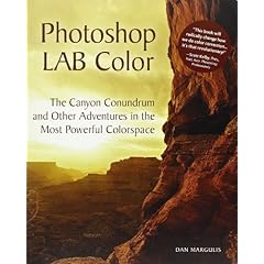
In an earlier blog I mentioned that one of my Christmas presents was Photoshop Lab Color: The Canyon Conundrum and Other Adventures in the Most Powerful Colorspace which, as it goes, is a very long title for a book.

Well I have finally finished it and I have to say it is really rather good. The easy writing style helps, the tutorials clear and there is a CD of images so that you can try it all out yourself on the images in the book.

The LAB colour space is designed to work in a similar way to the human eye and as such allows us to do things that are almost impossible in other colour spaces. When we view a scene we often perceive it as much more colourful than the film/sensor records it.

Anyway whilst on ephotozine the other day I uploaded a modification to this picture of Filey beach by Neil Davis.


I enhanced the colours with a simple LAB move that I learnt from the book, I promised to explain what I did to Neil, so here's how to do it.

The image has a very slight blue cast so we need to fix this before we enhance the colours otherwise we will end up with a bluer cast.


I Selected Image>Adjustments>Colour Balance and moved the yellow/blues slider towards Yellow a little (about -5) and repeated this with Shadows, midtones & highlights selected down the bottom.

Now its time for the lab magic.

Select Image>Mode Lab Colour. The Image>Adjustments>Curves.

First alt-click on the background of the graph thingy till it shows a series of fine grids like this:


We will ignore the lightness channel - you'll have to get the book to see what that's for, and select A from the channel drop down at the top of the screen.

Now slide the bottom point across to the first grid-line (the input box should read 10). Then slide the top point across to the first grid-line (the input box should read 90). You should get a curve that looks like this:


Now select channel B at the top and do the same with that. Click OK.

For a further colour boost you can use steeper curves so that they run from 20 to 80 instead of the 10 to 90 in the example. or even 30/90 as I have done here:


In the next blog posting I shall show a comparison of the different colour boost methods for you to compare.

Saturday, 10 March 2007

Beginners guide to Photoshop Levels

On ephotozine the other day I suggested a modification to this picture by Joline Frazier:


The modification is to use levels to help fix the underexposure of the shot. Generally it is best to get the exposure right in camera by adjusting the exposure compensation using the histogram. But sometimes its not possible, especially with a fully automatic camera, then it is time to reach for the levels tool in Phootoshop.

Select Image>Adjustments>Levels and you will see something like this:


The important bit is the graph in the middle. What this is showing is the range of the tones in the image from pure black on the left to pure white on the right with the midtones marked by the pointer in the middle. But hang on a second! this is a colour image why am I talking about Black and White?

Well as far as the levels are concerned everything can be represented on a scale of Dark to Light. A very dark blue being a little to the right of black and a very pale blue appearing just to the left of white. Looking at the graph (histogram) we can see that the image has most of its tones gathered to the left (dark) end of the scale with very little happening in the light end of the image.

If we desaturate the image we can see that there is a lot of gray tones in the image but few pure whites..which is basically what the histigram is telling us:


So how do we improve the exposure?

Simply grab the pointers under the histogram and drag them in to the edge of where the graph starts. I have done this for both the white and black pointers. This repositions the definition of black & white to the extremes found in the image:


Clicking OK, should produce a much better exposed image:


A quick look at the levels dialogue again shows that the images are much more evenly distributed:


Just for fun I ran a Digital Velvia action to boost the colours:

Friday, 9 March 2007

Landscapers - get up even earlier!!

I have often seen the advice in photo mags and books that for the best light you need to be in place half an hour before sunrise. Well I am coming to the conclusion that this is tosh!

I recon you actually need to be there at least 45minutes and ideally an hour before sunrise. Now I know what your thinking..."blimey that's an even earlier getting up time". Well yes it is, but there is not much difference between getting up at 2:30am and getting up at 2:00am really, both are pretty nasty!

The thing I have noticed is that quite often the spectacular sunrise colours happen up to 45 minutes before sunrise.


Southwold Sunrise (45 minutes before sunrise)
(click to view large)

But every time it's different. Some mornings the sunrise just doesn't happen, so have you wasted an extra half hour in bed?

Why not use the time to practice night shots or painting with light? I often take a torch or flash gun with me for this very eventuality.

Southwold Blues (1 hour before a sunrise that didn't happen)
(Click to view large)

So next time you are planning a landscape trip, why not set that alarm clock half an hour earlier?

Thursday, 1 March 2007

Chris Calver is Photographer of the month for March

Chris Calver is a brilliant of landscape photographer who captures the beauty of his native East Anglia with a seasoned eye. Visit his website to give your eyes a treat.


At Rest
Chris Calver

Should I upgrade to Vista ?

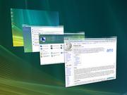
Quite a few people have asked me if the should upgrade to the latest version of Windows- Windows Vista.

Before I answer the question I should state my position on Microsoft. You will find an awful lot of rabid Microsoft haters out there who seem to see MS as the root of all evil and that all software should be open source and free. Another school of thought is that "no one got sacked for buying Microsoft" and you will find an awful lot of IT managers in this category.

I try not to fit in either camp, and would much rather take a pragmatic approach based on what works for me whether it is open source or not. My view of MS is that when faced with competition they can produce some of the best software out there, but when they don't have any competition they will sit back and not bother.

A prime example of this is Internet Explorer. Whilst MS were in the "Browser Wars" with Netscape they first produced a "me too" product, then continually developed and refined it till they produced a much better product than Netscape. Microsoft then sat back and relaxed for a few years as they dominated the browser "market" completely. Firefox then appears on the scene and starts to make inroads into that market. Lo and behold, Microsoft frantically rush to catch up with IE7.

The reason for this is simple economics, Microsoft don't charge for IE its only value is as a platform for MS to project its products into enterprises and homes. Investing money in a free product for no return would be tricky to explain to shareholders. MS are responsible to their shareholders at the ed of the day.

So, should you upgrade to Vista? My answer is an emphatic NO.

Vista is only an operating system. How much time do you actually spend doing useful work in the operating system? Not very much I reckon.

All most people use it for is starting their applications and occasionally organising their files. Most of your day is actually spent in the applications: your web browser, email, office, photo processing applications, etc,etc.

Improvements in the operating system aren't going to impact your productivity very much at all.

Upgrading the OS is usually a week or so of mucking about learning the new stuff followed by a week or two of going "oh is that it".

If your existing OS works fine why pay good money to upgrade it, when it will actually make very little difference to your life. Much better to invest that money in something useful like Raw Processing software, or a new lens, or beer, or fags.

If you buy a new PC and Vista comes on it that is fine, stick with it and learn of all the joys that Bill G and the guys have built in to this new wizzy version. I'm quite positive it is better in most respects. Just don’t bother to upgrade your existing machine..it won't enhance your life.