Wednesday, 31 January 2007

Puppy Farms

[[off-topic alert]]

I know this mainly a photographic blog, but hopefully you will forgive me this small divergence.

Smudge, who is one of our two cocker-spaniels, was rescued from a puppy farm nearly a year ago. Puppy farms are really horrible places that make battery farming look pleasant. "Rescued" doesn't mean that she was removed from the place by force, but rather that a dog rescue organisation had managed to convince the puppy farmer to hand over any "used" or "worn-out" dogs, rather than shoot them or club them to death.

When we got her, she was little more than skin and bones - because feeding her well would have reduced profits. Huge lumps of her coat were bald and she was terrified of human contact.

Please sign this petition (and forward on to anyone else you think would sign).
We need to stop this evil trade, and the horrendous treatment of dogs like Smudge.

Thank you for reading

[[/Off Topic Alert]]


To bring this (kind of) on topic, here is a picture of smudge as she is now; fighting fit, with a glossy coat and slightly less fear of people...oh and a cracking Clement Freud impression.

Smudge: Canon 20D 17-85EFS
(Click to view large)

The shot was taken in the garden on a bright sunny day. To achieve the black background effect I simply painted it in in Photoshop and applied a levels adjustment so that the black points in the coat matched the black I was using.

I got the idea for this technique from The Ephotozine Guide to Great Photography, highly recommended and full of inspiring photographs.

Tuesday, 30 January 2007

Digital Workflow Article (Part2)

So I have finally got round to completing part 2 of my articles documenting my digital workflow.

To be honest this part is a bit messy as very little of it is automated...and that is not a good thing if you ask me. I am hoping that as the year progresses I will move to either Adobe Lightroom or the new version of Capture One as both seem to offer the possibility of a more automated workflow.

The idea of having the workflow as articles is that I can update them as my workflows improve, the ultimate goal being that I only have to make the "Creative" decisions i.e. should this be in B&W ?, how about a crop? etc. The software should automate everything else: file locations, keywording, backups,etc.

Soon I will start work on part 3 which deals with presentation: prints, websites and web galleries. The final part will deal with archiving.

Monday, 29 January 2007

Understanding the Abstract

Abstract images are an area that I find an increasing attraction to, photography has always been a combination of art and craft and whilst I find the craft side interesting I find the real driver for me to be the artistic side and abstract work is the very epitome of this.

The whole idea of abstract photography is a bit strange really, as according to Wikkipedia: "Abstract art is now generally understood to mean art that does not depict objects in the natural world". How can a "straight" photograph ever depict objects that are not in the natural world?

Yes we can manipulate our images using digital (or traditional) techniques to render something different to what the film/sensor captured, but is producing the abstract possible with a camera alone? To be honest probably not!

Sometimes I like to use the term extract as I really can't put it better than Ansel Adams when he said:

I prefer the term extract over abstract, since I cannot change the optical realities but only manage them


Though when does a extract become an abstract image? Well my own personal definition of abstract is when you show an image to someone and the reaction you get is something along the lines of "I like that...what is it" or when you feel an overwhelming urge to put some explanation saying what it is when you display the picture.

The problem with abstract art/photography for a lot of viewers is in simply understanding it. Landscapes are easier on the viewer as they can appreciate the capture of a sense of place and time. Viewing a good landscape is essentially a passive activity and the same applies for most other areas of photography.

The abstract, however, makes demands on the viewer.."what is it?" or "do I like this?" and these demands can often put a lot of viewers off as they feel they don't understand the image or they are not sure how they are supposed to react to the image.

The trick with taking and understanding abstract work is to ask yourself "how do I feel about this?". Do the shapes and textures remind you of something? stir emotions? upset or even just amuse you. The same applies to taking them in the first place, as you look through the viewfinder what does the scene say to you?

If you find yourself just taking pictures "by the numbers" and not engaging with your subject then that is the time to ask yourself why you are taking the shot in the first place. But if you feel an emotion when you press the shutter release you are at least halfway to transmitting the emotion to the final print.

Belief; Canon 20D 17-85EFS
(Click to view large)

As an example I give you this image taken last Friday whilst sticking to my new years resolution. this is a small detail from the Salvation Army headquarters between St.Paul's and the millennium bridge. its an interesting building and I have photographed it many times yet never been happy with the results.

This time whilst looking for detail I noticed this cross embedded in a canopy over the door-way. A small detail that I doubt anyone but me and the architect would know is there.
I'm not religious but I do have a lot of time for the Salvation Army and as I viewed the simple symbol of the cross it seemed to me to sum up the power of a belief that had built the very building I was trying to capture.

Does it work as an image? Well that is up to you, the viewer, to decide.

Friday, 26 January 2007

Shadows and Highlights

Its funny how some commonly used terms are so rarely actually defined. For a forthcoming blog, I was trying to find a link on the new-fangled world wide web thingy to explain the term "Shadow Detail". Well I couldn't find a definition of the term anywhere, so I decided to write one myself!

It may not be exactly right, for all I know, but it's the definition I use:


One of the things photographers are always banging on about is "shadows" and "highlights". Now I may be a bit dim but when I started photography I couldn't work out how you knew which bits were the shadows, if you couldn't see the light source & direction.

Well it turns out that by "shadows" & "highlights" they are referring to the dark stuff & the light stuff. In a black and white photo the ultimate shadow is pure black and the ultimate highlight pure white. The area between is cunningly known as the "mid-tones".

With A brightly lit piece of coal on a sheet of white paper, the coal is the shadows, the paper is the highlights and if the light casts a grey shadow onto paper then that could be a mid-tone. How dark a highlight has to be before it becomes a mid-tone, and how dark a mid-tone has to be before it becomes a shadow...who knows!

The middle right-hand side contains the shadows,
the chrome is a highlight and some of the wood is a mid-tone.

(Click to view large)


Shadow Detail

Now one of the things photographers like to go on about a lot is "shadow detail", this is where you can see details in the darkest areas of your photograph, as opposed to the area just appearing as pure black. Generally, shadow detail is a good thing as it adds realism and depth to the image.

It is often possible to recover lost shadow detail in Photoshop though it is usually best to avoid losing it in the first place by correctly exposing the image.

Highlights

At the other extreme are the highlights, these are the brightest areas of your picture. At the extreme end you have pure white, which is fine if you wanted bright white, if not these are "burnt out" highlights. The problem with burnt out highlights is that they contain no information,at all and no amount of tweaking and adjustment in Photoshop will get them back.

ND Grad filters are often used to avoid burning out the sky in landscape photography, alternatives involve blending bracketed exposures in photoshop or another package.

Getting the exposure of a shot right is often a balance between blocking up the shadows and burning out the highlights. Generally its best to err on the side of blocking up the shadows rather than over-cooking the highlights.


Why not checkout my crash guide to exposure or this highly recommended book.


If you have a better definition of these terms, I would love to hear them. Please comment or drop me an email.

Wednesday, 24 January 2007

In the City


So I know you are all wondering if I am sticking to my new years resolution. Well so far I am two weeks in and I haven't fallen off the wagon.

The first Friday was a baptism of fire, well a baptism of overcast skies and rain really. A miserable grey day led to me wandering around The Barbican studying the patterns and shapes in the grey concrete blocks. Eventually I wandered over to The Citypoint building which I never fail to find interesting with its roller-coaster curves and unusual shapes.

This shot is an attempt to capture some of the feel of the building in an abstract way.

Canon 20D & 17-85 EFS
(Click to view large)

A week later and things had brightened up a bit so I headed for Canary Wharf and its brutally modern landscape of tower blocks and under-used docks.

The environs of Canary Wharf have been photographed so many times that everywhere you look is a photographic cliché. So I elected to use my lensbaby2 which never fails to give an unusual view of a scene. The lensbabies manual focusing and sweet spot you can move around the frame make for a very rich and involving way of making pictures.

I ended up at the base of One Canada Square, by the clocks that were really only placed there to give photographers something to shoot. Yet still the magic of the lensbaby provided a new interpretation of the scene.


Canon 20D & LensBaby 2
(Click to view large)

The thing I like about this shot is that I would never have thought of this as a shot I took. Its so far removed from my usual style that it surprises even me.

So, so far I am keeping to my resolution and stretching the boundaries of my work and making pictures that I like. So I reckon it's working.


Monday, 22 January 2007

Local.Live.com

I was just looking at my house on the Microsoft version of Google Earth: Local.live.com. When I noticed that the incredibly detailed aerial photos managed to capture a child's balloon floating in the sky above our street.

I just thought it was pretty cool:

The Balloon is at the top middle of the shot and my house is at the bottom.
(Click the image to enlarge)

Beginners guide to Photoshop Layers (Part 2) - Creating a border effect

So now we understand that layers work like clear acetate and can be stacked on top of each other, what uses can we find for them? Well in this example we will create a simple frame around our picture for display on a website. First open an image file that deserves a frame.

Create a new layer
We have already learnt about creating a new layer in the previous lesson. So lets add one now by clicking on the new layer icon or selecting Layer>new>layer from the menus. By default this new layer will be called "Layer 1".

Unlock the base layer
We want to place this layer underneath the background layer, but as the background layer is locked, we need to first unlock it. Once it is unlocked it becomes "layer 0". Now we are ready to get creative.

Slide the new layer under the picture layer
We want our picture to sit on the new empty layer (layer 1) . to do this we need to change the layer order by sliding layer 1 under layer 0 in the layers pallet so that it looks like this:

If we go back to the idea of layers being sheets of acetate then the ones at the top of the palette are at the top of the stack. So it doesn't matter what I paint onto layer 1 - you won't see it as it is hidden by layer 0.


Resize the canvas
So now we need to create some space round our image for the border. Select Image>Canvas size from the menu.
First select relative, this means the numbers are in addition to the to the current document size.
Then enter the size of border you require and click OK.

There can be quite a bit of trial and error with this so try out different numbers and if you don't like the size simply select Edit>Undo and try again.

In my case I have opted for a 4cm border all round the picture.


So now your image appears surrounded by an area of empty transparent space (the chequerboard pattern means its transparent).


Fill with colour
So, that's not too bad if we are printing onto paper, as the transparent stuff will come out white. But in this case we want a black border.

First make sure that the bottom layer is selected then chose Edit>Fill and select Black in the top drop-down box. Click OK and we get a nice black border round our image.


Add a layer style
Now I think it would look better with a small white line separating the border from the picture. to do this, we first select the image layer (layer 0) and then select Layer>Layer Style>Stroke from the menu.
Select the position as inside and then chose the colour and width you prefer. If preview is clicked you should be able to see the changes straight away.

You can do the same thing with layer 1 as well if you like, which gives us the final effect.


Next time, in part 3, I'll show how layers can help making "exposure" adjustments easy.

Friday, 19 January 2007

Jon Gibbs is Photographer of the month for January

Jon Gibbs is the Shepherdpics photographer of the month for January.

Jon is a master of landscape photography whose images sing with vibrancy and life, giving a real sense of place.


South Beach Study, Great Yarmouth,Norfolk
Jon Gibbs

As I have been a bit busy with my blog, we are already quite far into January, so Jon might be here for the whole of February too so that I can get back in sync.

Thursday, 18 January 2007

Beginners guide to Photoshop Layers (Part 1)

It always surprises me how many people are scared of using layers in Photoshop, they seem to be labelled as "Advanced" when they are really much simpler to understand than a lot of other things in Photoshop.

What is a Layer ?

A layer works like a piece of acetate placed over your picture....that's it really. Whatever you do on that layer will sit on top of the layers below, delete the layer and everything on it goes but the other layers are unaffected.

For example, open up a picture in Photoshop then take a look at the layers palette:


Your picture has come in to Photoshop as a layer called "background", this is a special layer that is locked. We will get round to how to unlock it later, but for the moment believe me when I say the padlock to the right means its locked. now we will add a new layer on top of this.

Adding a new layer

Click the new layer icon at the bottom of the pallet


and a new layer is added to the document. Because this is transparent (like clear acetate) you won't see any change to your document except that the layers pallet now looks like this:


So we have a new layer, layer 1, the fact that it is highlighted tells us this is the active layer so that anything we now do will only affect this layer, and the eye symbol tells us it's visible. Now take a brush tool and paint all over the image with it:


Now that's pretty - "but what's the use in that?", I hear you ask. Well if you click on the eye symbol next to layer 1 you can switch this off and on. So at any time you can see what the picture looks like with & without your changes.

A popular use for this would be when cloning out an element in the picture. First add a new layer then select the cloning tool and make sure sample all layers is selected. Now all the cloning is on this new layer and doesn't affect the background layers at all. Should you decide that the cloning doesn't work you simply drag it to the new layer to the bin at the bottom of the page.

If you save the image in Photoshop (psd) or tiff format your layers will be preserved for use next time you open the file.


Working with the Background Layer


The only thing that is special about the background layer is that it is locked. This means that we can't add layer effects, or change layer order and a whole host of other things. In order to unlock it simply double click on the little lock symbol. A dialogue box appears:


If you click OK you end up with the background layer renamed to layer 0, now it is exactly the same as any other layers in the document.

To change a layer into the background layer either:
  • Select Layer > Flatten Image, which will condense all the layers into the background.
or
  • Select the layer you want as a background and chose Layer>New>Background From Layer.

Deleting a Layer

To delete a layer simply highlight it in the layers pallet then either:
  • Right click and select Delete Layer.
or
  • Drag it to the little bin icon at the bottom of the layers palette.

Next time we'll look at using layers to create a simple border effect.

Monday, 15 January 2007

How this site is made

I have had a few mails over the last couple of months asking about the site and what software I used to create it.

Generally people are after an "out of the box" solution that will generate the site for them quick and easily. I'm sorry to say that I can't help with turnkey solutions as the site is pretty much hand crafted. If you are looking for a turnkey solution the Photium or clickpik are the people you need.

To create the site, first the menu layout and design were sketched out on paper, as I tried to work out what I did and didn't want on the site.

Then it was on to the front page, this was first laid out in Photoshop, doing this allowed me to play with fonts, sizes, colour and layout very quickly and easily. The front page is designed to act as a taster for the whole site.

Once I was happy with the design of the front page, I use Imageready (part of Photoshop) to generate the page as XHTML and CSS. Then it was into Dreamweaver to tweak the CSS so that it worked in most browsers (well lets hope so anyway).


Editing the site in Dreamweaver

A new page layout was then designed in Dreamweaver, based on the home page and this was saved as a template. The other pages were then based on this template to give the final effect I was after. Templates allow me to apply global changes to the site very easily and quickly...which is a good thing.

The galleries are generated using iView Media Pro to select the files, then the pages are generated using a set of templates I created.

This Blog is provided by blogger.com which is automatically copies any changes over to my own site, yet still allows me to edit it anywhere in the world...nice. The RSS feed from this is pushed through Feedburner to provide statistics and analysis.

I would be happy to explain more to those who have questions, if that's you then please email me on chris AT shepherdpics.com.

Sunday, 14 January 2007

I made the papers

I have had a picture in The East Anglian Daily Times yesterday. As part of a three page feature on the exhibition at The Basement Gallery, Ipswich.

The picture chosen was "May in July", taken at sunset on Derwent Water. I haven't actually seen the paper myself as I am well out of their circulation area, but I am told it looks good.

Thursday, 11 January 2007

A new years resolution

OK, I know I'm a little late with this one, but I always think a promise made in the cold light of day is always so much better than one made after a lot of bevies on a new years eve followed by hugging a lamppost telling it that it's your best mate.

Well my photographic resolution is to work harder at my London Light/London Life Project specifically I will get out and take pictures every Friday that I am in Central London.

The reason is, quite simply that I find Central London really difficult to photograph, its busy,cluttered and not really the sort of place that appeals to me at all visually. But that's the point, it's only by stretching ourselves that we find new ways of interpreting the world around us in our photographs.


We choose to go to the moon in this decade and do the other things, not because they are easy, but because they are hard, because that goal will serve to organize and measure the best of our energies and skills.
JFK


Wish me luck with my resolution, it may be one small step for me but it might be a giant leap in my photography.


Treads
Taken on a dull day on The Southbank, London

Wednesday, 10 January 2007

Studio Courses

Few people outside of Canon know as much about the EOS system as Dave Newton who is the Technical Editor for EOS magazine.

This year Dave has started to branch out into running training courses including collaborations with the likes of Andy Rouse. The first course this year is on Basic Studio Photography, If this is of interest then places are still available through his website.

Tuesday, 9 January 2007

Look Out

Yet again I find myself offering to host a file or a picture for a friend. Well this is supposed to be a blog about photography and I needed a shot for today, so here it is:


Look Out
By Kind Permission of: Robert Mitchell

This is the first ever shot Robert has posted on the web so he would appreciate any comments you have about it.

Recommended Blogger

Looking for another interesting photography blog to read? Well why not take a look at Paul Indigo's blog. It is well worth a read, as it is packed full of thought provoking articles about taking pictures.

Give it a look - you know you want to.

Monday, 8 January 2007

Stuck in the LAB again.


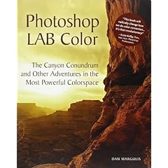
One of my Christmas presents was Photoshop Lab Color: The Canyon Conundrum and Other Adventures in the Most Powerful Colorspace which, as it goes, has to be one of the longest book titles I have come across in a long time.

It's a long and detailed book that takes some reading, I found it was best to work through about two pages then work out what disk that comes with it was talking about with photoshop and the example disk that comes with it.

But once you get used to the LAB colour space and using the curves to modify it, then it does start to make a lot of sense. The book is cleanly written with lots of examples and the accompanying CD provides just the sort of example images you need to understand the concepts involved.

When would I use LAB? Well I'm only halfway through the book but the advantages seem to be that the LAB colour space separates contrast from colour information. Tweaking the curves (ohh listen to me, I didn't understand curves at all till I read the book!) allows you to boost contrast in areas that would normally be impossible in other ways.

The other use seems to be to provide a real differentiation on groups of similar colours, which would be very difficult to do in any other way, even with the raw processor.

A recommended read for those of you who really want to get into the guts of photoshop. Here is a quick "before and after", I've been playing with (click on the images to view large..it's quite subtle and only really works big):


Original after Raw conversion.


A minor LAB tweak later and Tower Bridge emerges from the gloom and the HMS Belfast has got its colour back. The changes were applied to the entire image yet the man's orange jacket and sign are unchanged.

Sunday, 7 January 2007

I got me some buffalo!

Over the last few weeks I have been carefully documenting my photographic workflow. As I looked at each part of my process I kept checking that everything is backed up and safe.

Looking at my archive of images for the last 5 years I realised that I was on the verge of running out of disk space as I had room for just a month or twos shots left. I make that time to get me a pair of Buffaloes.
Buffalo LinkStation Pro

The Buffalo Linkstation Pro is a network file-server in a box. I got myself two of the 500GB version which should give me plenty of room for my photos for a few years.

I'm sure many of you think "two 500GB drives - that's a terrabyte" - well actually it's not. It's one 500GB drive with a backup to mirror it, I stopped buying hard disk drives in ones a few years back when I kept getting asked to help people who had lost loads of important documents due to a hard disk crash. Now I always buy drives in pairs so I have a live and a backup, a 120GB internal drive and a 250gb USB drive to back it up for example.

My first impression of these drives is that they are a real quality product and the people at Buffalo have really thought about what you might need from an external drive.

Installation is a breeze:
  • take it out the box
  • plug it in to the mains
  • plug it in to the network
  • Switch it on
  • Sorted!
You don't really need to install the client software, but it's worth doing just so that you can find and rename the Linkstations to something more memorable.

Configuration of the backup is done through your web browser. I had a little bit of a problem with this and in the end was forced to read the manual that comes on the CD. The trick is to first configure the backup target share as a "Disk Backup" (you will find it under Shared Folders set-up>Shared Folder Support). then go to the primary drive and set-up the backup to this share.

What is really neat about this backup is that the drives do it themselves, even if my PCs are switched off the drives will still back themselves up every night...cool!

I'm currently looking for a good location for the backup drive as I've just realised that it is directly under the cold water tank in the loft. I will try to ensure that both drives are as far away from each other as possible to increase security a little in event of a flood.

A real quality product...I'm impressed.

Saturday, 6 January 2007

Edward Norton - Nature Photographer

Last weekend I popped up to The Basement Gallery to see how my work was going in The Painters With Light Exhibition that is on there.

Whilst I was there I was very pleased to see Edward Norton's first exhibition in the same gallery. I have met Edward on many occasions and its always a pleasure to shoot along side such a talented technician and all round good chap.

Having seen his work on the web it was great to see his work as prints, where they really come to life. If you are visiting Ipswich in January I strongly recommend you pop down to The Basement Gallery: 11 Elm St & 12-14 Princes St and checkout Edwards Beautiful images.


Candle Snuff
By Kind Permission of Edward Norton


Friday, 5 January 2007

POLICE WARNING:

I came across this warning today and thought it best to pass it on to all dog owners:

Police have issued a warning to all dog owners: Watch your dog!
A sniper has been picking off dogs one at a time and almost a dozen have been killed or wounded so far. These horrible attacks have occurred predominantly in the Glasgow area. Police say they have a suspect and an arrest warrant has been issued, but so far, they haven't been able to nab him. Police have distributed a photo (attached) of the alleged suspect please keep your dogs safe and distribute this to anyone who has dogs in the area.


I'm a Blogger

Well I've finally given in and joined the blogsphere. I've just converted all the existing shepherdpics news feed to a blog format and though there is still a bit of work to do, I thought I would release my random ramblings on the world.

Hopefully you will find my musing on digital photography and anything else that catches my eye of interest. Please feel free to comment on my blogs as I love getting feed back.

Chris